RANKING THE 10 BEST LIVERIES FOR THE 2021 F1 SEASON FROM WORST TO BEST
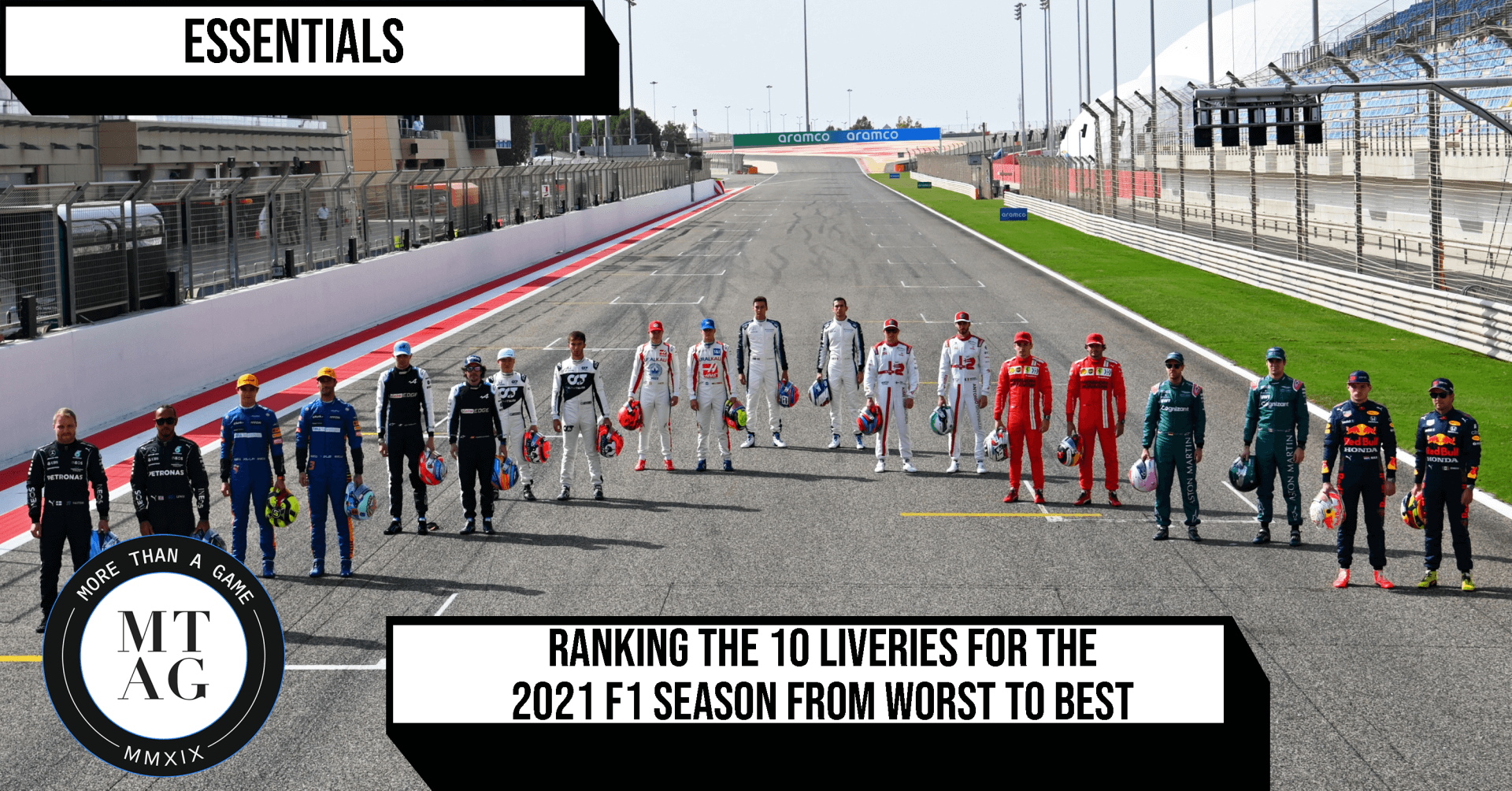
With the end of pre-season testing in Bahrain, F1 fans can almost start counting the days before the lights go out for the season opener in Sakhir. The 3-day prelude allowed the teams to get some much-needed miles under their belt but also gave viewers their first look at the new cars in the flesh.
Having hosted virtual launch events in keeping with the new normal, the 10 challengers were revealed over the course of the last month before they took to the track last weekend. Here’s how I ranked the new bits of kit on show for the 2021 championship.
10. Williams

Williams had the right idea here – start from a clean slate that ushers in the era under their new ownership with a fresh design whilst paying homage to the team’s illustrious past by taking obvious cues from the all-conquering early 90s cars. But they’ve made a mess, with the abrupt transition from white to blue and not enough yellow to offset it. The main offender here, however, are the obtuse lines that dominate the rear end, even obscuring the team logo.
One can only hope it fares better on track.
9. Ferrari

F1’s oldest team will never veer far away from its unmistakable red livery so it’s all about the subtle details that determine the Prancing Horse’s look, and the SF21’s complete lack of subtlety make it one of the worst looking Ferrari cars in a while. The introduction of burgundy, taken from last year’s beautiful 1000th GP car is poorly executed and abrupt and the car could use a whole lot more white accents.
And then there’s the big, green elephant in the room. The Mission Winnow logo is unlikely to feature on the car at any race this year due to stricter anti-tobacco advertising laws than ever, so getting everyone to talk about the striking green font at the launch and during testing is a smart marketing ploy. Still, this might just be the most un-Italian thing since pineapple on pizza.
8. Mercedes

The W12 is a less-than-fitting successor to the stealthy, stunning beast that was the W11. When Mercedes made the late change from their usual silver to black at Lewis Hamilton’s request last summer, they produced an iconic livery worthy of their dominance on track. This is a step backwards in the looks department.
The Ineos accents have changed from wine to a jarring red, the hints of hyper turquoise don’t blend in as well as usual but most of all, the rear end has been plastered with AMG logos (a classic case of the marketing department strong-arming the design team) that rightly spawned a series of memes. Oh well, at least they kept Niki Lauda’s red star.
7. McLaren

The McLaren is perhaps harshly marked for its lack of imagination than anything else – it would be near impossible to tell this year’s livery apart from its predecessor. The papaya and blue colour scheme has never really hit the spot and while it does stand out on track, I was hoping that the McLaren-Mercedes reunion would bring back the stunning chrome and red colour scheme donned by the championship contenders driven by the likes of Jenson Button and Lewis Hamilton of the early 2010s.
6. Red Bull

Speaking of cars unchanged from the year before, it was no surprise to see Red Bull once again sticking with the same livery since 2016. Probably only behind Ferrari in how recognizable it has become, the look could even be deemed a future classic if Bulls could somehow replicate some of their Vettel-era dominance from the last decade.
That said, if it wasn’t for them replacing Max Verstappen’s partner every season, the Austrian outfit could have just replayed the clips from their previous launches and no one would have guessed.
5. AlphaTauri

Red Bull’s sister team has produced another solid look in its sophomore season since its rebranding from Toro Rosso to AlphaTauri. The navy colour scheme is much more prominent, sweeping throughout the car rather than just the rear, whilst the white isn’t forgotten either, seen on the rims in what is a unique touch compared to the rest of the field. Little hints of red from the Honda branding round it off.
4. Haas

Unpopular opinion – this is one good looking car. Yes, Haas deserve every bit of the negative press that has come their way these past few months and the colour scheme is a very obvious workaround by Dmitry Mazepin to make sure him and his son’s Russian heritage is on display.
But looking at it from a purely objective standpoint, this is one of the cleanest designs on the grid.
The red, white, and blue lines swoop seamlessly from back to front, as well as being cleverly layered across the front wing. The retro vibe from the numbering is arguably the best as well.
It’s a shame the team have abandoned development for 2021 as the structure is looking a bit dated, especially with its big front end.
3. Alfa Romeo

It’s red, it’s white, it’s an Alfa – enough said. The Swiss-Italian team has drawn from the latter’s design heritage to adorn their 2021 challenger once again with a stunning livery. In some ways, the C41 is a mirror-image of the 2020 car, with the deep red taking over the bottom half, blending much better with the black floor. As long as the serpentine symbol that is the Biscione, dominates its exterior, it will continue to grab eyeballs on the track.
2. Aston Martin

As soon as the images of the legendary British racing green began circulating on social media back in December, the hype surrounding Racing Point’s rebranding to Aston Martin and the car that would come with it has been palpable. Thankfully, it was worth it as this clean number from Sebastian Vettel’s new team has struck the right balance between the past and present. It could do away with the little pink bits courtesy of co-sponsor BWT and maybe sport a darker shade of green, but I guess you can’t have everything.
1. Alpine

Like the Aston, this is another entry from a rebranded team that perhaps benefits from being a fresh face on the grid, with the team formerly known as Renault having entered a new era in some style. They have nailed the implementation of the tricolore around the rear, with a subtle nod to it on the front as well. Most impressive of all is the choice of metallic blue, which stands out and yet goes under the radar thanks to the matte finish. It was a close-run thing between the two new kids on the block, but this round just about goes to the French.
Read More
2021 F1 SEASON: THE TOP 5 THINGS TO BE EXCITED ABOUT
ADITYA GOKHALE \
ESSENTIALS

RANKING MY TOP 5 MAX VERSTAPPEN MOMENTS
ADITYA GOKHALE \
FEATURES
INSIDE F1’S ONLINE TAKEOVER GONE GLOBAL
KABIR ALI \
FEATURES